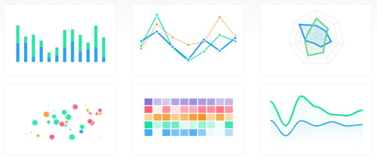

A lot of web applications require the administrator or even the user to view statistics, and not many people enjoy just looking at numbers on a screen. Using graphs you can very easily display data on your web page that easy to understand.
Why use ApexCharts
ApexCharts, is a free to use JavaScript library that lets you create graphs and charts easily and provides you with a number of options to fiddle around with and make perfect for your web application.
Something I actually really like about ApexCharts is the ability to download a snapshot of the chart. You can download a CSV, PNG or SVG version of the graph.
How to use ApexCharts
You can either download the JS files and store them locally, which you can do here. or you can use a CDN version, which is what I did as I find it easier to let a CDN host these types of files for me.
If you want to use a CDN, you can find it here. All you need to do is copy and paste the code from that page into your head tag.
You’ll need to set up your HTML file like so
<html>
  <head>
    <title>Apex</title>
    <script src="https://cdnjs.cloudflare.com/ajax/libs/apexcharts/3.23.1/apexcharts.min.js"></script>
    <link rel="stylesheet" href="https://cdnjs.cloudflare.com/ajax/libs/apexcharts/3.23.1/apexcharts.min.css"/>
  </head>
  <body>

    <h1>
      Apex
    </h1>

    <div id="chart">

    </div>

  </body>
</html>
The above HTML code sets up everything for us to get started. CDN is loaded in, and it’s ready for us to add the code for the graph.
So now we’ll add the options, you can do something like the next bit of code or pick your own options.
var options = {
  series: [{
    name: "Desktops",
    data: [10, 41, 35, 51, 49, 62, 69, 91, 148]
  }],
  chart: {
    height: 350,
    type: 'line',
    zoom: {
      enabled: false
    }
  },
  dataLabels: {
    enabled: false
  },
  stroke: {
    curve: 'straight'
  },
  title: {
    text: 'Product Trends by Month',
    align: 'left'
  },
  grid: {
    row: {
      colors: ['#f3f3f3', 'transparent'],
      opacity: 0.5
    },
  },
  xaxis: {
    categories: ['Jan', 'Feb', 'Mar', 'Apr', 'May', 'Jun', 'Jul', 'Aug', 'Sep'],
  }
};
Once we’ve got the options set up we are then able to render the graph. You can easily change the type of the graph to one of the other provided ones.
var chart = new ApexCharts(document.querySelector("#chart"), options);
chart.render();
When you combine all of this, and you run the page, you should have a line graph display across the screen, showing you the data that we provided in the options set above.
